> ## Documentation Index
> Fetch the complete documentation index at: https://docs.utilified.com/llms.txt
> Use this file to discover all available pages before exploring further.
# Dashboard
> The dashboard gives you a high-level overview of your organisation's energy management — totals, spend, connections, sites map, and expiring agreements.
The Dashboard is the first page you see after logging in. It provides a high-level overview of your organisation's energy management activities.
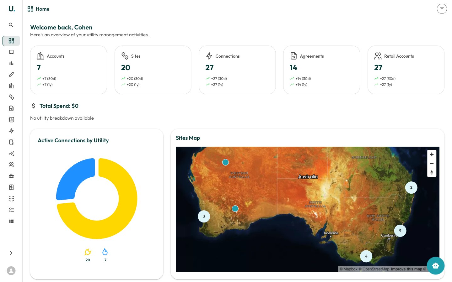 ## Summary cards
At the top of the dashboard, five summary cards display your key totals:
| Card | Description |
| ------------------- | ------------------------------------------------------ |
| **Accounts** | Total number of customer accounts in your organisation |
| **Sites** | Total physical locations across all accounts |
| **Connections** | Total electricity, gas, and water connections |
| **Agreements** | Total energy agreements (active and historical) |
| **Retail Accounts** | Total retail account references with energy retailers |
Each card shows the current count along with growth indicators — how many were added in the last 30 days and last year.
## Total spend
Below the summary cards, the **Total Spend** section breaks down your energy expenditure by utility type:
* **Electricity** — Total spend and consumption in kWh
* **Natural Gas** — Total spend and consumption in MJ
* **Water** — Total spend and consumption in kL
Each utility type is colour-coded: yellow for electricity, blue for natural gas, and light blue for water.
## Active connections by utility
A donut chart showing the distribution of your active connections across utility types. Hover over each segment to see the exact count.
## Sites map
An interactive map of Australia showing the geographic distribution of your sites. Clustered markers indicate groups of nearby sites — click a cluster to zoom in. Individual site markers can be clicked to view site details.
## Recent accounts
A quick-access list of the most recently created or viewed accounts. Click any account name to navigate directly to that account's detail page.
## Agreements expiring soon
Displays agreements expiring within the next 90 days, sorted by urgency. Each entry shows:
* Agreement name and type
* Customer name
* Days remaining until expiry
* Expiry date
A badge at the top shows the total count of expiring agreements. Click any agreement to view its full details.
## Filtering
Use the filter icon in the top-right corner of the dashboard to narrow the data displayed. Filters allow you to focus on specific accounts, utility types, or date ranges.
## Summary cards
At the top of the dashboard, five summary cards display your key totals:
| Card | Description |
| ------------------- | ------------------------------------------------------ |
| **Accounts** | Total number of customer accounts in your organisation |
| **Sites** | Total physical locations across all accounts |
| **Connections** | Total electricity, gas, and water connections |
| **Agreements** | Total energy agreements (active and historical) |
| **Retail Accounts** | Total retail account references with energy retailers |
Each card shows the current count along with growth indicators — how many were added in the last 30 days and last year.
## Total spend
Below the summary cards, the **Total Spend** section breaks down your energy expenditure by utility type:
* **Electricity** — Total spend and consumption in kWh
* **Natural Gas** — Total spend and consumption in MJ
* **Water** — Total spend and consumption in kL
Each utility type is colour-coded: yellow for electricity, blue for natural gas, and light blue for water.
## Active connections by utility
A donut chart showing the distribution of your active connections across utility types. Hover over each segment to see the exact count.
## Sites map
An interactive map of Australia showing the geographic distribution of your sites. Clustered markers indicate groups of nearby sites — click a cluster to zoom in. Individual site markers can be clicked to view site details.
## Recent accounts
A quick-access list of the most recently created or viewed accounts. Click any account name to navigate directly to that account's detail page.
## Agreements expiring soon
Displays agreements expiring within the next 90 days, sorted by urgency. Each entry shows:
* Agreement name and type
* Customer name
* Days remaining until expiry
* Expiry date
A badge at the top shows the total count of expiring agreements. Click any agreement to view its full details.
## Filtering
Use the filter icon in the top-right corner of the dashboard to narrow the data displayed. Filters allow you to focus on specific accounts, utility types, or date ranges.